Uncategorized

An Exceptional Bear Market

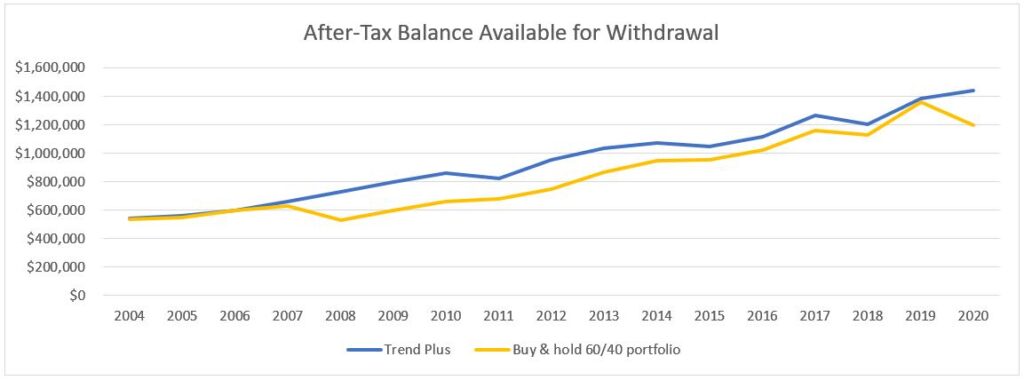
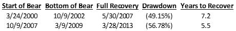
We think it is a good time to review bear markets, since we just had one, or are still in one, depending on the definition you choose to use. It is generally accepted that a bear market occurs when the stock market is down at least 20% from recent highs. There seems to be less agreement; however, on when the bear market is officially over. Some will say the bear market ends when the indices are no longer down 20% from those highs, some say it’s when indices are more than 20% from the lows, while others say it ends when stocks fully recover and make new all-time highs. We think the latter definition of when the bear market ends is the most appropriate.

The stock market can exhibit all sorts of patterns when making a recovery from a bear market low. Think about the labels the pundits have been discussing on TV regarding the shape of this bear market – will it be “V-shaped”, or “U”, “W”, “L”, “swoosh”, etc.? All of those names signify some sort of recovery and an end to the bear market. At least the “V”, “U”, and “W” shapes seem to indicate that you need to get back as high as where you started – with ending points at the same level as beginning points – this aligns with our preferred definition of when bear markets end.

But those aren’t the only shapes the recovery can take. Imagine a different shape – how about a “radical” bear market? The radical symbol, used to designate the square root of a number, looks like this:

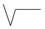
If we modified that symbol slightly, by starting at a higher point and having the horizontal line remain lower than the starting point, like this picture below, what market scenario would that describe?

One example of this could be that the market sells off about 30%, then rallies 28.6%, then trades in a sideways pattern for a period of time. Example chart below:

A recovery of this shape would meet the first 2 definitions of the end of the bear market, as the market would no longer be 20% below the recent highs and also is more than 20% above the low point. If you were a buy & hold investor through this type of market, would it feel like the bear market is over? We doubt it. While you may be happy that your accounts have recovered so much from the lowest point, you would also be aware that you are still down 10% (i.e., you’ve lost 10% of your money), and are probably frustrated that so much time is passing while not being able to achieve any new gains.

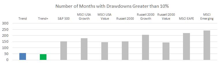
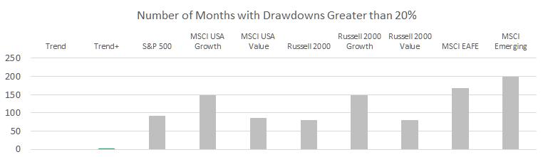
As we’ve stated in a previous article (https://stockcharts.com/articles/dancing/2019/10/trend-and-trend-plus-drawdown-863.html), the duration of the drawdown may end up being just as important to an investor as the magnitude of the drawdown. If the sideways market goes on for a long time, even if you’re not down that much, you may still consider abandoning your investment plan and putting your money to work in other areas that seem to be able to generate a return.

Remember, the goal of investing is not to break-even but to make a return (i.e., new gains); therefore, we don’t think the bear market is over until that happens. This is why we think that the correct definition for the end of the bear market is when the indices fully recover and notch a new all-time high. That’s the point at which investors feel relieved that they have survived the bear market and can start making new money. This definition is also the only one that can be applied consistently to recoveries of any shape. For example, if the market were to drop 20% from where we are currently, people who use the other definitions of a bear market would have to consider it as a separate bear market from the one that started in February.

Given our preferred definitions of what constitutes a bear market (20% below recent high) and when a bear market ends (when a new high is made), let’s look at the bear market we are currently in compared to others in history.

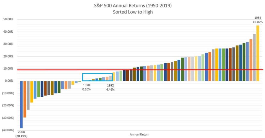
We’ll start out by showing you lots of data on previous bear markets. Below are two tables showing the bear market statistics for the Dow Industrials beginning in 1885 (Table A) and the S&P 500 beginning in 1927 (Table B).

Table A

Table B

These two indices are generally tracked as the “market” when looking at U.S. stocks. The terms in the tables are simple enough, but so there is no confusion on the dates we’re measuring from; “Peak Date” is the high point prior to the bear market, “Trough Date” is the lowest point in the bear market, “Recovery Date” is the date at which the market achieves a new all-time high after being in a bear market, “Decline” is the period between Peak Date and Trough Date, and “Recovery” is the period between Trough Date and Recovery Date. We’ve included the 2020 bear market at the bottom of each table, based on where we sit as of the most recent trading day of May 22nd. The trough date of March 23, 2020 assumes that we will hit a new high and recover from the bear market prior to hitting a lower low than what we saw on that date. We will only know in hindsight if that will be the case.

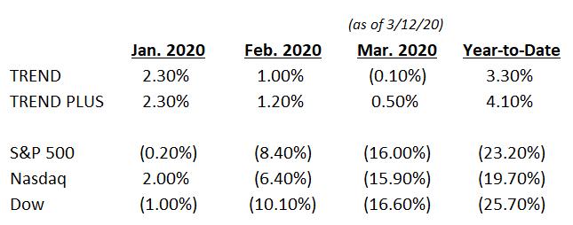
The data on past bear markets shows that the quickest decline in the S&P 500 (Table B) took 101 days in 1987, while the average decline of the previous 10 bear markets in the S&P 500 took 521 days – that’s close to a year and a half – and that’s just the time it took to reach the bottom. It is a very painful process to invest for over a year and continually lose money. In contrast, the 2020 decline only took 33 days (provided that we continue the recovery and don’t hit a new low) – this bear market decline was so fast that it hardly showed up on investor’s monthly account statements before the recovery was underway.

The average time for the S&P 500 to recover from the trough to a new high was 1,575 days or, if we exclude the crash of 1929, which seems to be an outlier, the average recovery still took 845 days (more than 2 years)! The average total length (duration) of the past bear markets in the S&P 500 (excluding 1929) was 1,314 days, or more than 43 months. The bear market of 2020 has lasted just 93 days so far – and if it fully recovers any time soon, it will go down in history as the quickest bear market we’ve ever had. An exceptional bear market, indeed.

If the quick recovery occurs, many will espouse the merits of buy & hold investing, citing this bear market as an example of why it is better to stay invested through the market downturns. Even if the market does fully recover soon, it doesn’t change the fact that having your investments go down 34%, with no guarantee that they will recover quickly, is still a very painful experience. By the way, the recovery is certainly not in the bag, yet! The S&P 500 is currently down about 12.7% from the February highs and the Dow is down 17.2%. Investors are still trying to get back to even. We’ll wait to see what happens, but fortunately, our trend following approach did not suffer anywhere near the level of drawdown that passive investors experienced.

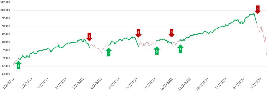
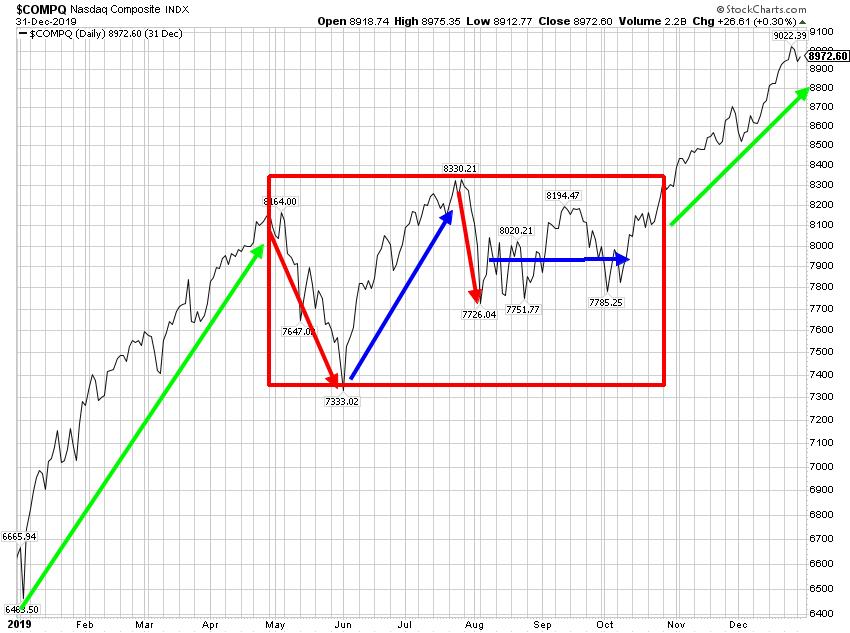
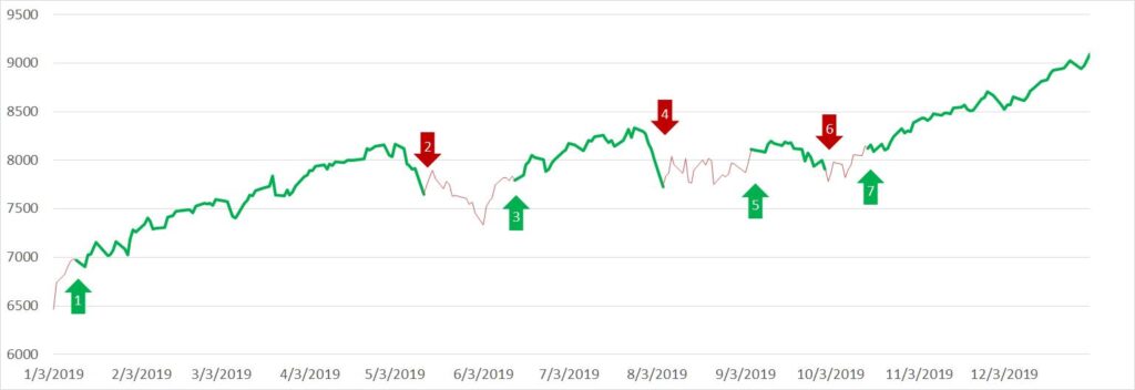
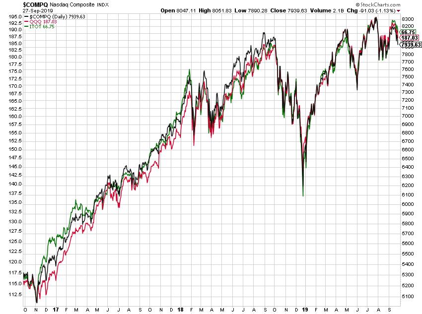
Our trend following model is very focused on risk management and avoiding the devastating losses of bear markets. Even though this bear market is shaping up to be different than any other in history, our approach did not disappoint and allowed us to avoid material losses. Chart A shows the Nasdaq Composite for 2020, colored green when our model had us invested and red when it had us defensive. 

Chart A

We never get out at the top and never get in at the bottom, rather we get out when the uptrend breaks down and get back in when there is evidence of a new uptrend in place. Trend following doesn’t guess!

Even though we are still in a bear market, the fact that an uptrend is in place has allowed us some participation in the market recovery. We will never capture all of the upside, as that is impossible unless you’re willing to capture all of the downside too. The biggest difference between our approach and a buy & hold strategy is that our accounts did not lose much when the market rolled over – so we very quickly started making new money with the new uptrend, as opposed to just recovering losses.

It is times like this that being a rules-based trend follower really pays off. We don’t have to listen to the ever-droning financial news media or listen to all the experts guessing about what the market is going to do, or what shape the bear market recovery will take (as if anyone knows). We face no uncertainty in how to execute, even in uncertain times – we just follow our model with extreme discipline.

If you are interested in incorporating trend following or tactical investment management into your investment plan, you can reach out to Grant directly by email (grant@mscm.net). Grant manages various tactical and trend following strategies at McElhenny Sheffield Capital Management for individual investors and other advisors.

Dance with the Trend,

Grant Morris

Read More
Uncategorized

Taxes Are the Consequence of Successful Investing

In light of tax season being near (albeit delayed) and that we find ourselves in the midst of a bear market, we thought it was a good time to discuss active management and taxes, which is something we are asked about regularly. We often get asked about the impact of taxes on how we invest, and if taxes erase the benefits of active management. Those are valid questions and our response is consistent – taxes are the consequence of being a successful investor.

There are a number of things to consider when trying to balance an investment approach or manager with the desire to be tax efficient. To be clear, we are not tax experts or CPAs and are not providing tax advice here, just some food for thought on the topic.

It is true that active management, and especially tactical approaches such as trend following, can create more trades and turnover in a portfolio, thus resulting in more short-term gains or losses than a passive/buy & hold approach. Those trades will have yearly tax consequences if done in a taxable account, while running an active/tactical strategy in a tax-deferred account, such as an IRA, will defer taxes and provide a better after-tax return over time. Does that mean that you shouldn’t use an active strategy in a taxable brokerage account? Not necessarily.

Our trend following approach was not designed for tax efficiency per se, it was designed to provide a good return over time without suffering the devastating losses that come from bear markets. The desire of investors to always be tax efficient can even be counterproductive – if you never make any money investing, you don’t have to pay any taxes – that would be pretty tax efficient, right? Taken to a logical extreme, the most tax-efficient investing approach is one that loses money consistently – allowing investors to offset other gains or income each year with their capital losses. This obviously misses the point of investing.

In 2020, short-term capital gains (“STCG”) are taxed as ordinary income, with marginal tax rates ranging from 10% up to 37%. Many advisors and investors – the buy & hold crowd – think you should always hold appreciated securities for at least 12 months (if not indefinitely) in order to receive long-term capital gain tax treatment. Long-term capital gains (“LTCG”) are taxed more favorably, at rates of 0%, 15%, or 20% (depending on taxable income and marriage status). We could agree with this view if the buy & hold approach also delivered the same or better performance than trend following, but we don’t think it does. Sometimes it is much better to pay taxes on the gains you get to keep than to let a position with a gain unwind and turn into a loss. There are also some behavioral issues surrounding paying taxes and retirement that we’ll address in our next article.

Some will argue that if you never sell your winners, thereby avoiding taxes on the gains, then there is more money left in the account to compound over time, leaving you better off in the long run. Perhaps, but there are no guarantees it will work out that way – and this sounds like something a buy & hold manager would say because they don’t know how to do anything different. If you are a passive index investor, bear markets can ruin this approach. Or, if you have a portfolio of “quality stocks that never go down”, you are kidding yourself. Just look at long-term charts of GE, Boeing, Kraft Heinz, Exxon Mobil, IBM, 3M, and countless other blue-chip companies that have given up 5, 10, or 15 years’ worth of gains recently. People who owned these companies, and never sold because they didn’t want to pay taxes on their gains, have just solved their tax problem – no more gains!

At the end of the day, what matters is the after-tax return to investors – so let’s compare some after-tax results of an active approach (our Trend Plus) versus a passive approach (a typical 60/40 stock and bond portfolio).

Table A is an excerpt from a schedule showing the modeled returns before and after taxes of the Trend Plus strategy (net of fees), from 2004 through yesterday’s close (March 25, 2020). The years in the middle were hidden just for display purposes. Normal disclosure applies – we have not been running this exact strategy this long – the actual strategy results start in 2017.

Table A

2004 is the normal starting point we use to present our return data in marketing materials and this is more than 16 years of return data. Most investors have about 15 to 20 years of serious wealth accumulation and investing prior to retirement: you don’t make much money when you are working and young; once you have a family, expenses are high and you are trying to keep up; then finally, when kids are out of the house and you’re well established in a career, the serious savings and investing happens. Generally, this may start between ages 40 to 50 and end between ages 60 to 70, give or take years on either end. The 16-year history presented in Table A lines up with that timeframe. Also, the vast majority of these years were in strong bull markets, which should tilt this analysis in favor of the passive approach that we’re arguing against.

For the after-tax returns, we have assumed that:  (1) all gains are short-term in nature, (2) taxed at the highest current marginal income tax rate of 37%, and (3) the taxes are paid out of this account (again, all assumptions tilting the analysis in favor of a passive approach). This results in an after-tax compounded growth rate for Trend Plus of 6.7% over 16 years.

Table B shows the same timeframe with a passive (buy & hold) investment in a portfolio of SPY (S&P 500 ETF) and AGG (bond index ETF). Total returns including dividends are used for both ETFs and we assume an annual rebalance to the 60/40 weighting between the two holdings. 

Table B

These buy & hold returns do not include any management fees paid to an advisor, and since we are assuming this is a passive investment and always deferring the taxes, we have not applied any taxes (again, tilting the analysis in favor of passive). In reality, long-term capital gains tax would apply at each annual rebalance and also whenever funds might need to be withdrawn for spending needs. Even without applying any taxes, the after-tax compounded return of this account is 6.4%, lower than the results from Trend Plus. Chart A below shows the cumulative after-tax gain of both approaches over time.

Chart A

After a historic 11-year bull market (2009-2019), deferring taxes by being a buy & hold investor did not come out ahead – further highlighting the benefit of avoiding the devastating losses of bear markets. Sure, if we stopped the analysis at the end of 2019, or picked any number of different dates, passive could have come out ahead, but look at the whole chart, not just the end point – it was very close or even behind Trend Plus for more years than it was ahead. No one knows what the frequency or severity of bear markets will be going forward – passive investing falling behind during this 16-year period is just one thing to consider.

Another thing we like to look at is the after-tax balance that would be available to withdraw in any given year (not just at the end), since we don’t know exactly when funds would be needed. This is a way to assess how liquid and flexible your investment account might be and to consider the fact that the tax on long-term gains will need to be paid at some point.

Table C shows the same pre-tax returns of the passive 60/40 portfolio, but this time, in each year we assume we need to withdraw the entire balance, and thus pay long-term capital gains of 20% when doing so. 

Table C

This is not a schedule that tracks a balance through the years, rather each year is a separate calculation of what would happen in that year if all funds were withdrawn. For example, if nothing is withdrawn until the end of year 2017, you start 2017 with a balance of $1,153,087, add investment gains of $166,562 but then pay 20% taxes on the cumulative long-term gains made from 2004-2017, or $163,930, ending the year with an after-tax balance of $1,155,719. This after-tax balance available for withdrawal on the passive approach can be compared to the ending balance each year for Trend Plus in Table A .

Chart B shows this comparison of the after-tax available balances each year of both approaches. This after-tax balance is what you’d actually have available to spend on things you want in retirement in.

Chart B

Again, Trend Plus (with STCG) compares very well to the passive investment (with LTCG), matching or beating it in nearly every year, and pulling ahead of the passive approach when bear markets occur. We think this illustrates that trying to justify buy & hold strategies because of their tax efficiency is wrong.

Trend following seeks to avoid large drawdowns and bear markets, while passive investing accepts the randomness of bear markets (the frequency and severity of all future bear markets that are in your investing horizon). Trend Plus has outperformed the buy & hold approach in this timeframe because it avoided large drawdowns in 2008 and now in 2020, even after considering taxes.

Some other things to consider about this analysis and the tax implications of different investment approaches. Do you know what tax regime is going to persist while you are investing, and also during your retirement/withdrawal years? Will income tax rates be higher or lower? Will long-term capital gains always receive favorable tax treatment as compared to ordinary income? Do future changes to tax code make active or passive a better after-tax approach? Good luck guessing!

When it comes to trend following, it is true that there is high turnover because we only buy when the trend model indicates an uptrend is in place, and the holdings are always sold when our stop loss target is hit. Often, the short-term loses will offset much of the short-term gains, and the resulting tax consequence isn’t much. It is certainly more tolerable than losing money. If your advisor or broker is concerned more about taxes than investment performance, you should find another advisor or broker.

If a client receives a large tax bill at the end of the year for capital gains, we sort of expect a “thank you!”, because that means we made them a lot of money.

Dance with the Trend,

Grant Morris

Read More
Uncategorized

Trend Following Was Ready, Were You?

On February 13, 2020 we published an article called “Ready for a Bear?”. On that day, the S&P 500 and Nasdaq Composite were closing near all-time highs, and 3 trading-days later on February 19, 2020, they both notched their peaks of this 11-year bull market cycle. The Dow Jones Industrial Average peaked a little earlier on February 12, 2020, the day prior to our article. Were we trying to “call a top,” or did we know that a market crash was imminent? Of course not – no one knew – even though pundits and clowns on TV will try to tell you they did!

The purpose of our previous article was simply to explain that there was evidence mounting that we would have a bear market in the not too distant future and it’s best to prepare for those ahead of time. We had no idea how close the “not too distant future” would be – mere weeks from when we published.

We are trend followers who use an un-emotional rules-based model to manage how we invest, for ourselves and our clients. We think trend following is the best approach to investing, in any market environment, because it is always prepared for the eventual bear market. Bear markets are what destroy most portfolios and retirement plans and we don’t think you should take chances with your serious money.

At the time of our last article, we did know that certain components of our Weight of the Evidence were deteriorating and turning off.

  • On January 27th, the first indicator in our model turned off. This is a short-term breadth indicator that looks at Advances and Declines.
  • On January 31st, 2 other indicators turned off; a short-term price indicator and one of our relative strength indicators that looks at how small cap is trading compared to large cap.
  • On February 3rd, another breadth Advance/Decline measure turned off.
  • On February 7th, a breadth indicator that looks at new highs versus new lows turned off.

As you can see, breadth was deteriorating at the end of January and into February. Greg has written dozens of articles in this blog on StockCharts.com about market breadth and its value at market tops. You can scroll through the archive on ‘Dancing with the Trend’ to find them. Breadth can provide an early warning of “topping” activity – but as with any type of indicator it gets it wrong sometimes too.

After February 7th, the market continued up for a little while, and we actually saw improvement in our model readings with some indicators turning back on. Our positioning didn’t change through this time period though, we just paid very close attention to the market action.

The first big down day after this point was Friday, February 21st, which had a minimal impact on the Weight of the Evidence reading. Given the strength of the uptrend we had been in, our stop level was at the widest setting of 6%. The close down on the Nasdaq on Feb. 21st put us within about 3% of our stop level.

Then, on Monday Feb. 24, the market gapped down over 3% and opened below our stop level. We use specific trading rules to try to avoid selling in a flash crash or other trading anomaly, but when the market stayed below our stop level after our trading rules expired, we sold out of the equity positions (QQQ and ITOT). If you have read previous articles, you know we use these ETFs because of their high correlation with the Nasdaq Composite Index.

Selling begets selling, and more indicators turned off each day as the pullback led to a correction, which led to a full-fledged bear market with major averages being down over 20% on March 12th. Sometimes, when our Trend model is quick to sell, it ends up being a whipsaw trade with the market bouncing back rapidly – we are more than willing to withstand those whipsaw trades because we consider that the “cost” of always having significant downside protection for when the markets don’t bounce back. Like now.

Table A shows sort of a timeline of the model readings.

Table A

For obvious reasons we cannot provide the exact indicators being used, and have just assigned numbers to them, but the way to look at this is that each column is an indicator that provides its own determination of whether the market is in an uptrend (1=yes, 0=no). This is what goes into the Weight of the Evidence – we don’t rely on any single indicator, rather we look at when multiple (and different) indicators are all confirming an uptrend. Nearly all of this is discussed in Greg’s book, “Investing with the Trend”.

Chart A shows our model positioning over time, with green indicating when we were invested in QQQ and ITOT, and red when we were in money market funds for TREND, and in GLD and IEF for TREND PLUS. We’ve shown this before for 2019, but have expanded it into 2020 to show the recent activity.

Chart A

Buying at #3 and selling at #4, and buying at #5 and selling at #6, where both whipsaw trades. These aren’t fun when you are in the midst of a bull market, but they are part of any rules-based approach and typically result in merely lagging the market while it’s moving up – these are the trades we are always willing to make to ensure that we also sell at #8.

As of the close on March 12th, the Dow, S&P 500, and Nasdaq are all more than 20% below their highs – officially a bear market.

Table B shows the year-to-date performance numbers (net of fees) of the TREND and TREND PLUS strategies, compared to these indices. Please note these have not been reviewed yet by our auditor, as that only happens quarterly.

Table B

So, what now? Many who have ridden the market down to this point might think it’s now too late to sell out of their positions and start taking a new approach. We disagree. It is always a good time to give up on an investment approach that is not meeting your needs. No one knows if the market is going to rebound quickly, trade sideways for a while, drop another 20%, or anything in between. Any outcome is possible, and since there is a very real possibility that more losses could occur, liquidating positions to protect capital might be the best option. The hard part about selling now is that, if you don’t use a process like trend following, there will be no clear sign of when to get back invested. Nobody announces that the coast is clear and a new bull market has begun – the bottom will only be identified in hindsight.

Our process will get us back invested when the next uptrend is established and we’re happy to sit defensive until then.

Grant manages various tactical and trend following strategies at McElhenny Sheffield Capital Management for individual investors and other advisors. If you are interested in incorporating them into your investment plan, you can reach out to him directly by email (grant@mscm.net).

Dance with the Trend,

Grant Morris

Read More
Uncategorized

Ready for a Bear?

The title of this article might make you believe that we are bearish on the market. If you have read some of the last 200+ articles in this blog, you know that we do not make forecasts or guess about the direction of the market; we follow our rules-based trend following model…period. While we are not necessarily bearish on the market, it does seem like nearly everyone expects a bear market to occur in the not too distant future, even if they don’t explicitly state that. Let us explain.

All over the financial media we see articles and stories about the future returns expected from the S&P 500 over the next 5 to 10 years. These articles usually discuss stock market valuations based on long-term average P/E ratios or the cyclically adjusted price earnings (CAPE) ratio, and note that when valuations are high, as they are currently, expected future returns from stocks are low. Most analysts are estimating the future returns of U.S. stocks to average only about 2% a year for the next 10 years, and possibly even have negative returns on a real basis, after considering inflation.

What these articles imply, but never address explicitly, is that in order to average only 2% a year for 10 years, you must have a bear market crash during that period. Why? Because the S&P 500 rarely returns 2% in a year, and definitely isn’t going to start having low returns each year for 10 years. Instead, the way it will average down to 2% a year for 10 years, is it will have “normal” returns (5%-30%?) for most of the 10 years, with maybe 1 or 2 large negative years – this is the bear market that everyone’s analysis bakes in, but they don’t address.

Chart A shows the annual returns of the S&P 500 since 1950 (70 years of data) sorted from the lowest return year (2008, -38.49%) to the highest (1954, +45.02%).

Chart A

The blue box near the middle are the years where the S&P 500 returned between 0% and 5%, which is about what most people are forecasting for the next 10 years. There were only 8 years out of 70 where the S&P 500 had low returns in that range, and none of them were consecutive years. Doubtful the next 10 years are all going to fall in that range. The red horizontal line is at 9.14%, which is the simple average over these 70 years. 38 of the years were above the average, 13 years were below that average but still above 0%, and 19 years saw negative returns.

There are any number of ways that the next 10 years could average 2%. For example, there could be 9 years that return the average of 9.14% and then 1 year that loses 44.5%. If the 9 years of positive returns are above average, then the bear market year will need to be lower than -44.5%. You get the picture.

How has it looked when these low returns have happened in the past? Table A shows all of the 10-year periods in this 70-year history that saw a compounded growth rate of less than 3%.

Table A

All of these periods in history saw at least 1 or 2 large negative years and all periods covered at least 1 bear market (1973-74, 2000-02, 2008). I guess it’s always possible that the U.S. equity markets just meander sideways for the next 10 years earning between 0% and 5%, but I think that is pretty unlikely given it has never done anything close to that in its history. The more likely outcome, if the analysis of P/E and CAPE ratios is to be believed, is there will be at least 1 bear market in the next 10 years, and I think the authors who publish this type of analysis would agree – and should probably at least acknowledge that their analysis implies a bear market is coming.

If you agree that a bear market will probably occur within the next 10 years, and that is the driver of these low expected returns – how should you invest for this future?

If you choose to be a buy & hold investor (could be active or passive), then you are accepting a 10-year period with very little investment growth, and maybe none at all, after inflation. You’ll get all the upside as the bull market continues, but will get all of the downside too. Hopefully you’ll actually be able to “hold” through the downturn to get the benefit of an eventual recovery (most end up selling on the way down) …and that your time horizon is sufficiently long enough to withstand those lost years. Most passive investors are probably hoping that the next bear market is still many years away, but eventually it will have to be dealt with, and of course what you hope for has nothing to do with what will actually happen – hope is a lousy investment plan!

If you are an active value investor and choose to remain on the sidelines as long as the market remains overvalued – you could be waiting for a very long time. Valuation metrics are a terrible timing indicator as they can stay elevated for long periods, and the market can easily become even more overvalued. Most value investors are probably hoping for the bear market to happen soon, as this presents the buying opportunity they’re waiting for. Again, hope is a bad plan. No one knows if the next bear market is going to start this year or in nine years. Can you imagine being under allocated to U.S. equity markets if we don’t end up having a bear market for another three or five years, or longer? Everyone around you will be touting their stock market gains while you are labeled a perma-bear who missed participating in what could end up being one of the great bull markets. If you manage money for clients, they’ll be the ones missing out on the upside and you’ll probably be fired before too long.

Tactical strategies, like trend following, that are willing to move to defensive positions in bear markets can provide the best solution. Trend following is the one approach we know of that can be deployed at any time during a market cycle and still achieve good results. If the bull market continues for one, or two, or five more years, trend following will allow for continued participation in some market upside. All the while, a rules-based trend following approach, with defined stop levels, provides protection against the downside of an eventual bear market. There is no silver bullet investment approach though – as we’ve discussed in these articles before, trend following is of course subject to whipsaws, and struggles in sideways choppy markets (Feb-Apr 2018 is a recent example). Those times can be frustrating; however, bear markets can be devastating.

Maybe you don’t think the P/E or CAPE levels matter or that they are not predictive of low future returns. How about the business/economic cycle, or the debt cycle? Does any of it matter anymore? Sitting today near the end of the 11th year of a bull market, I don’t see many arguments that this can continue for another 10 years…at some point, I think you have to expect that this bull market will come to an end. If you think there will be another bear market in your investing future, we think trend following is the single best approach to navigate that bear market, especially since the timing of it is unknown to everyone.

Grant Morris manages various tactical and trend following strategies for individual investors and other advisors. If you are interested in incorporating them in your investment plan, you can reach out to him directly by email (grant@mscm.net).

Dance with the Trend,

Grant Morris

Read More
Uncategorized

News is Noise – 2019 Recap and Model Review

2019 was an easy investing year for everyone, right? The S&P 500 was up 31.5% (including dividends) while the Nasdaq Composite was up 35.2%; the best year for each since 2013. I’m sure everyone did at least that well. Many will look at the 2019 year-end results (especially in a few years) and think that the market must have been strong all year, but looking closer you will see that wasn’t the case. It also helps when looking back, to recall what news was making headlines and what the investor sentiment was during historical time periods.

Chart A shows that the Nasdaq Composite Index had 3 distinct periods during the year.

Chart A

The year started in a strong uptrend, continuing from the lows on December 24, 2018 to the end of April. This was followed by a second period from early May until late October that consisted of a market correction, where the Nasdaq dropped by more than 10%, bounced back to a new high, sold off again, and then traded sideways (consolidation) for about 3 months. The final leg up started early October but didn’t reach a new high until November, and then continued to make new highs to the end of the year.

Recall that 2018 ended with the U.S. equity markets falling during the 4th quarter and ending the year negative. The Nasdaq fell 23.6% and the S&P 500 dropped 19.78% at their lowest points on December 24th; this is what set the stage for 2019 and was top of mind for investors. Both indices made a v-shaped bottom (only known in hindsight) and started their new uptrend from December 26 to the end 2018 and leading into the 2019 chart above.

During January and February, it seemed like almost everyone thought another pullback was imminent and that the market action was just a dead cat bounce. We heard all over that “markets never bottom this way” and we may have even thought that ourselves. Very few wanted to increase their equity allocation for fear of buying right before the next leg down. For some, the 20% decline in the 4th quarter of 2018 was enough to take them completely out of the equity markets. Selling on the way down may have been the easy part for them because it stopped the pain of losses – but now they have to decide at what point do they get back in, unless they plan to hang up their investing hats for good. The 1st quarter of 2019 seemed full of negative news stories; a downturn in the U.S. economy, a corporate earnings recession, the trade war, a global recession, Fed policy mistakes, release of the Mueller Report, and on and on. If one follows news or pays attention to the talking heads on CNBC it was hard to feel too optimistic about the market’s rebound – but rebound it did. The news never gives an all-clear signal on when to get back invested.

Moving into the 2nd quarter, the Nasdaq was able to eke out a few new highs at the end of April, but once May came, the sell-off that everyone was waiting for was finally here. We heard/read that the bull market was now too old as it just had a 10th anniversary, the trade war was escalating with additional tariffs, the recession may not come in 2019 but it’s definitely coming in 2020, and on and on. The Nasdaq fell 10.8% – a legitimate correction – but then rebounded again to new highs; then sold off again, but not quite as much, then had some consolidation over the slow summer months. In August, the Fed made the first of three interest rate cuts in their “mid-cycle adjustment” – we heard that if the Fed is cutting rates the economic data must really be bad. We also saw inverted yield curves in the U.S. for the first time since prior to the 2008 recession – the news said this was a clear warning sign for a recession, but not clear enough to know when it would come, but maybe somewhere between 3 and 18 months in the future, or maybe longer, or maybe not at all.

After the yield curve un-inverted, the Fed made their 2nd rate cut, and then their 3rd, tensions with China calmed down – and the market moved higher once again. The last 4 months of the year saw the S&P 500 gain 10.3% and the Nasdaq gained 12.7%. Of course, the news at this point was that the move was too strong and we were overbought and to expect a sharp pullback. Still waiting.

We won’t go as far to say that ALL of the news is just noise to investors, but certainly most of it is. It is very hard to keep up with all of the news, harder still to make sense of all of it, and what is not just the hardest thing, but actually impossible, is to know how the market will react to any of it. No one knew markets would be up over 30% in 2019, no one. News is mostly noise.

Tough year to be an investor…just like every other year.

Below is a quick update on what our trend following model did in 2019. Chart B is the red and green “in and out” chart that we’ve shown before. The line is the Nasdaq Composite shaded green when we were invested in U.S. equity ETFs and shaded red when the strategy was in cash (for Trend) or in defensive non-correlated ETFs (for Trend Plus).

Chart B

We came into the year positioned defensively, after side-stepping nearly all of the losses in 4th quarter 2018, then had seven position changes throughout the year (invested to defensive, or defensive to invested). The position changes mid-year ultimately were whipsaw trades, i.e., we bought back in at higher levels, therefore it was unnecessary to sell and would have been better to remain invested. This, however; can only be identified in hindsight. Every time we sell it is because we feel the uptrend has broken and that is not a market in which we want to participate. All major pullbacks start this way – of course, so do a lot of minor ones. Even with the whipsaw trades Trend returned 16.6% and Trend Plus did 21% in 2019 – these are verified returns, net of the management fee.

We want to stress again the fact that absolutely no one knows what the market will do the next day, next week, next month, ever. Many television experts want you to think they know; but you only have to pay attention for a period of time to know they cannot be consistently correct, and you should cease listening to all the noise. The beauty of rules-based trend following is that you do not need to guess where the market is going; it just follows it. The short-term whipsaws that are part of any trend following system can be frustrating, but a bear market can be devastating. We have been on a bull run for almost 11 years; there are many who have never been in a bear market, believe it will never happen again, and do nothing to protect their hard-earned investments. We feel sorry for them.

Dance with the Trend,

Grant Morris

Read More
Uncategorized

Trend and Trend Plus – Risk-adjusted Returns

This article will wrap up the presentation of various performance metrics for two of our trend following strategies, Trend and Trend Plus.

The last few charts will focus on risk-adjusted returns, which attempt to measure how much risk a strategy takes in order to generate the returns. Looking at risk-adjusted returns is a very popular way to evaluate different strategies, especially if the strategies are taking a different approach to markets (passive, active, tactical, etc.). Investors should care about how much risk will be taken with their investment in order to generate a certain level of return. However, we find this is not always the case – we’ll explain more at the end.

A very common risk-adjusted return measure is the Sharpe ratio, shown in Chart A.

Chart A

Most readers will be familiar with the Sharpe ratio, which measures an investment’s excess return, above the risk-free rate, divided by its standard deviation. This is a popular performance metric, especially for those in the modern portfolio theory camp that believe risk is volatility.

We labeled this chart with “long-term” because it covers the entire period from 1997 through September 2019 (including 2 bear markets) that we’ve been presenting in this series of articles. Many websites publish 3-year, 5-year, or 10-year Sharpe ratios. As of right now (near the end of 2019), those timeframes only include one bull market in U.S. equities. It is very rare for a 10-year historical period to not include at least one bear market, but that’s where we find ourselves today. If you are using Sharpe ratios to compare different investment options, you need to understand what historical timeframe the ratio covers and how the strategies might behave differently in other market environments. Strategies that move defensive in bear markets are likely to have a much better Sharpe ratio than buy & hold approaches when compared over full market cycles.

Another, more nuanced, risk-adjusted return metric is the Return Over Max Drawdown (RoMaD), shown in Chart B.

Chart B

RoMaD takes the annualized returns earned over a time period divided by the maximum drawdown that occurred. This measures how much drawdown pain you had to endure to earn the returns. Over the time period from 1997 through September 2019, the S&P 500 saw returns of 6.3% a year and went through a max drawdown of -56.78% (RoMaD = 6.3 / 56.78 = 0.11). Trend Plus however saw returns of 13.4% a year with a max drawdown of only 21.22%, resulting in a much higher RoMaD. This is the value of generating good returns while avoiding big losses in your portfolio.

The last chart we’ll present is the RoMaD since the start of the current bull market, which began when the S&P 500 bottomed on March 9, 2009. 

Chart C

The S&P 500 has returned 15.1% a year since the bottom in 2009 and the largest pullback was in 4th quarter of 2018, where it almost dropped into bear market territory, with a drawdown of -19.78%. Trend Plus has achieved 10.8% a year with a max drawdown of -14.54%; nearly keeping up with the S&P 500 on a risk-adjusted basis, even during this strong bull market. Trend, which is more conservative, has not kept up quite as well during this time.

Some investors will see this chart (or similar ones published on other sites) and say that the S&P 500 is the best performer on a risk-adjusted basis, so one shouldn’t pay fees for active management. This seems reasonable on the surface, but fails to consider the timeframe being covered, and how the strategies might perform in a market environment that is not being evaluated. Chart B paints the full picture, but unfortunately the various sites used to do research on investment options rarely provide enough information to evaluate this correctly. I guess if you put your head in the sand, and don’t think we’ll experience another bear market in the future, passive could be the way to go. (A previous article discussed the frequency of bear markets.)

One final comment on risk-adjusted returns. We have found most prospective clients are very interested in risk-adjusted returns when comparing different investment options, whereas existing clients tend to forget about risk management and focus more on relative returns (relative to the S&P 500, typically). We think this is normal human behavior as it’s hard to see or feel “risk,” but it is very easy to see the returns on monthly statements. If a client is mentally comparing those returns to the S&P 500, the relative performance is what causes an investor to be happy or not with their investment decision. This is even more pronounced during a very long bull market (i.e., today). On the way up, many investors will abandon a risk-managed strategy to chase S&P 500 returns, and this may even be one of the reasons that a bull market continues – more and more investors piling into the market. At some point though, there is no one left to buy, and those investors who stayed focused on risk management will be rewarded.

If you are interested in incorporating Trend or Trend Plus into your investment plan, you can contact Grant Morris directly by email (grant@mscm.net).

Dance with the Trend,

Grant Morris

Disclaimer: Please note that when we show performance metrics in these articles for the Trend and Trend Plus strategies, they come out of our model and are not results from actual trading over the entire time period. Live trading on the current strategies has been done since 2016, with verified performance results starting in January 2017.  When we present metrics from live trading on the actual strategies, we will note them as such.

Read More
Uncategorized

Trend and Trend Plus – Reduces Ulcers

This article will continue the presentation of various performance metrics on our two strategies, Trend and Trend Plus. We showed Chart A previously but are including it again before we introduce Chart B. Chart A shows the correlation of our two strategies and several other indices, relative to the S&P 500 Index.

Chart A

Correlation, usually designated as R, is the statistical measure that shows the relationship between two datasets and how they move in relation to each other. That is not the textbook definition for correlation but will suffice for now. Correlation ranges from +1 (totally correlated) to -1 (inversely correlated), with 0 being non-correlated. The direction and strength of the correlation is nice information to know. Low (or negative) correlation between assets and/or strategies is where the diversification benefit comes from (as discussed in the last article).

Chart B shows R-squared (R2), the Coefficient of Determination, also known as the goodness of fit. This is just the square of the correlation coefficient R.

Chart B

Many people look at R2 thinking it is similar to R – R2 is reported on financial websites used to research mutual funds and ETFs – but R2 tells you nothing of correlation. Squaring correlation to get R2 will always give you a positive number between 0 and 1, thereby removing the useful information about how the datasets are correlated (positively or negatively). If you take Trend’s correlation in Chart A of 0.432 and square it, you get 0.1867 which is shown in Chart B. If another strategy had a negative correlation of -0.432, it’s R2 would also be 0.1867. The coefficient of determination provides less information than correlation, even though it is more widely reported.

In theory, R2 tells you the percent dependency of one variable on the other, and usually in finance and investing this relates to how much of the movement in a fund is explained by movement in the index. It is often mistaken that funds are better if they have a higher R2. This is incorrect, as a higher R2 only tells you that the beta measurement is more reliable. R2 is especially not useful when looking at tactical strategies – those that, by design, do something completely different than the index (like when Trend and Trend Plus move defensive). Again, most of what is used in modern finance is not very helpful if you do something different than invest with a buy & hold strategy.

Moving on. We also discussed Drawdown in a previous article as being a better representation of risk since it is loss of capital. If you plotted the cumulative drawdown from 1997 through September 2019, the mean (average) is ‑5.2% for Trend and -4.5% for Trend Plus.

Chart C

The Ulcer index was created by Peter Martin when he wrote The Investor’s Guide to Fidelity Funds in 1989. The Ulcer index takes into account only the downward volatility for an issue plus uses a price crossover technique with a 21-period average. The Ulcer index attempts to quantify risk by focusing on both the magnitude of the drawdown and also the amount of time spent in the drawdown. A much more believable risk measure than standard deviation, which is where modern finance hangs their hat.

Chart D

A strategy that spends a significant amount of time in a mild-drawdown state might be just as difficult for an investor to stick with as one that has a more severe drawdown but recovers quickly. The Ulcer index attempts to capture this. Trend and Trend Plus are focused on avoiding big losses, so recovery and time spent making new money usually happens quicker, resulting in lower (better) Ulcer index scores.

Grant Morris at McElhenny Sheffield Capital Management manages these two strategies. You can reach out to him directly by email (grant@mscm.net) if you are interested in working with him.

Dance with the Trend,

Grant Morris

Disclaimer: Please note that when we show performance metrics in these articles for the Trend and Trend Plus strategies, they come out of our model and are not results from actual trading over the entire time period. Live trading on the current strategies has been done since 2016, with verified performance results starting in January 2017.  When we present metrics from live trading on the actual strategies, we will note them as such.

Read More
Uncategorized

Trend and Trend Plus – Friends with Diversification Benefits

Last time we showed you charts of many different market indices along with two of our strategies; Trend and Trend Plus. We started with drawdown (our preferred measure of risk), instead of starting with returns, as we believe that managing risk is the more important aspect of developing strategies. Risk management is paramount to an investor’s ability to stick with a strategy – and the returns of a strategy don’t really matter if the investor will never be able to withstand the painful periods (and yes, all strategies go through painful periods, especially buy & hold).

Here we will show you more charts of the same indices with different measures of comparative performance. This data covers the period from January 1997 through September 2019; a time which experienced two bear markets. 

Disclaimer: Please note that when we show performance metrics in these articles for the Trend and Trend Plus strategies, they come out of our model and are not results from actual trading over the entire time period. Live trading on the current strategies has been done since 2016, with verified performance results starting in January 2017.  When we present metrics from live trading on the actual strategies, we will note them as such.

Chart A shows the compound annual growth rate of each issue. Our strategies have significantly outperformed major indices over full market cycles. We think trend following should be a “friend” to all investors – most people are more focused on returns than on risk management (even if the returns are a direct result of risk management) and trend following has historically performed well over full bull and bear cycles.

Chart A

Charts B and C show the best and worst monthly returns, respectively. Trend and Trend Plus are invested the same when our model calls for equity exposure and therefore have the same result in their “best” month.  

Chart B

Stop levels are maintained at all times and will move the strategies defensive when equity markets sell off, reducing the worst months.

Chart C

Chart D shows the annualized volatility of each issue. Annualized volatility is based on the standard deviation of daily returns; standard deviation being the degree to which the returns vary from the average over a given time period. As stated in the previous article, we don’t think volatility is as important as drawdown in measuring risk for investors, but it can provide insight to the return behavior when comparing it to other strategies – with lower volatility being evidence of a lower risk strategy.

Chart D

Chart E shows the Beta of each issue when compared to the S&P 500 Index. Beta is often thought of as the measure of systematic risk, or exposure to the movements of the overall stock market.

Chart E

Chart F is the correlation of our strategies and the other indices to the S&P 500.  

Chart F

The benefits of diversification (reducing risk at a given level of expected returns) are driven from the inclusion of low or non-correlated assets in a portfolio – this is why most people invest in stocks and bonds together and may even diversify into other geographies – looking for assets with low correlation. What is often missed by financial academics and followers of Modern Portfolio Theory, is that diversification benefits can also be realized by combining different investment approaches that have a low correlation to the existing portfolio. If you are a buy & hold investor and already have something like a traditional 60/40 stock and bond portfolio, you will receive great diversification benefit (i.e., risk reduction without sacrificing returns) by adding a tactical approach like trend following to your existing portfolio.

If you are a do-it-yourself investor working on your own strategy or trading system, we hope these articles provide some insights into ways to evaluate your own performance and ability to stick to your approach, and might encourage you to incorporate multiple investment approaches to receive benefits from diversification.

Grant Morris at McElhenny Sheffield Capital Management manages these two strategies.  You can reach out to him directly by email (grant@mscm.net) if you are interested in adding them to your portfolio.

Dance with the Trend,

Grant Morris

Read More
Uncategorized

Trend and Trend Plus – Drawdown

What is risk? The sterile laboratory of modern finance wants you to believe it is volatility. They say that volatility is defined as standard deviation. I have opposed that academic mentality often in these articles. If you use standard deviation it means you also believe the markets are random and normally distributed. Anyone who believes that probably also believes in astrology, Fibonacci series, and a host of other magic tricks. Most investors know what risk is when they open their annual account performance statement and see they have a standard deviation of .36 and their account is down 32% for the year. Do you think they call their money manager concerned about their standard deviation? Of course not, they just lost 32%; that is what they are concerned about.

Loss of money is risk, and loss of money can be measured by a concept called drawdown. Drawdown measures how far an investment account (or market, index, ETF, stock, etc.) has fallen from its previous high value. Drawdowns of -10% to -20% are generally considered “corrections” while drawdowns of greater than -20% are known as bear markets. This article will try to convince you that real risk is drawdown, and not volatility as modern finance wants you to believe.

Drawdown has two components, its magnitude (amount of decline) and its duration (amount of time it was below the high price). Many forget that the duration of drawdown is also important.

Index investors in the S&P 500 have seen 2 major bear markets in the last 20 years. The below table shows the magnitude of those drawdowns and how long the recovery was before investors were able to start making new investment gains. 

Table A

The bear that started in March of 2000 saw accounts get cut nearly in half, and spent over 7 years losing money and then trying to recover losses to get back to even. The bear that started in 2007 had a larger drawdown magnitude, seeing a nearly 57% decline, but the recovery back to even happened almost 2 years quicker.

Which was worse? It probably depends on a number of things like your age, your net worth, the actual dollar values lost, and when you need the money from your investment account. A drawdown of 25% that takes a long time to recover might be far worse for you than a drawdown of 40% that recovers quickly. 

If you are building your own trading/investing strategy, and run backtests to determine the efficacy of your system, I highly encourage you to evaluate all the drawdown periods. Many do-it-yourself investors choose which system to use based on only the final outcome – which one provided the best return over time. This can often be a mistake because they fail to evaluate if they could have actually stomached the trading on the strategy over the whole time period. Investing is like dieting this way, the best plan for you is the one you can actually stick with. A strategy that has great returns over a 10-year period but also had significant drawdowns is one that most investors can’t handle when real money is on the line. You might think you can, but seeing losses of $40,000 on a $100,000 account, or maybe losses of $200,000 on a $1M account, can have a tremendous negative impact on your psyche when you start to think of those lost dollars in terms of time spent earning them, or the lost purchasing power in retirement. You have to be very honest with yourself in this process and not be swayed by the outcomes of strategies that you really can’t achieve.

Passive investors and the “buy & hold” crowd also ignore drawdown far too often (especially 10 years into a bull market, like we have right now). They choose not to actively invest their money, as their plan is to never sell and just passively invest in index funds for the long term.  Most of them are fooling themselves – not being honest about their ability to hold through the severe downturns that are inevitable. Buy & hold investing in index funds only works if you can accomplish both steps, buying (easy) and holding (hard). Most investors can’t hold when an index falls 30%-40% – they panic-sell on the way down because accruing additional losses of real sizeable dollar amounts is far too painful!

Below are charts showing various measures of drawdown from our trend following strategies that are managed by Grant at MSCM. The period of analysis used was from January 1997 through September 2019 (~22 years). This is an important time frame as U.S. equity markets experienced two large bear markets during this period. Please note, that when we show performance metrics in these articles for the Trend and Trend Plus strategies, they come out of our model and are not results from actual trading over the entire time period. Live trading on the current strategies has been done since 2016, with verified performance results starting in January 2017. When we present metrics from live trading on the actual strategies, we will note them as such.

Chart A shows the maximum drawdown of many market indices and our Trend and Trend Plus strategies. We don’t think it is necessary to elaborate on this as it is obvious that our strategies are very focused on avoiding large losses.

Chart A

Chart B shows the same issues and the number of times there was a drawdown greater than 10%. Keep in mind this data also includes all drawdowns greater than 10%, some which could be in Chart C showing drawdowns of greater than 20%.

Chart B

Chart C shows the same issues and the number of times there was a drawdown greater than 20%. And yes, Trend never had a drawdown greater than 20%; Trend Plus had only one.

Chart C

Recall that earlier we said drawdown is not just how far an issue declines (magnitude) but how long it stays in a state of drawdown (duration). Chart D shows the issues and the number of months those issues were in a state of drawdown greater than 10%. Seeing your account down more than 10% often leads to second-guessing your investment plan.

Chart D

Chart E shows the number of months that the issues were in a state of drawdown greater than 20%. Seeing your account down more than 20% is obviously even more difficult and will cause many investors to abandon their plan.

Chart E

It should be obvious that Trend and Trend Plus focus on reducing drawdowns and avoiding large losses. We think this is absolutely necessary to not only compound over time at a higher rate (large losses kill compounded returns) but also to make for a smoother ride with fewer gut-wrenching times that investors and clients want to abandon their plan. Of course, avoiding large losses is only beneficial if you can also deliver adequate returns, which we plan to present in a future article. Like we always say, we try to participate in the up markets and avoid participating in the big down moves.

Grant Morris at McElhenny Sheffield Capital Management manages these two strategies. You can reach out to him directly by email (grant@mscm.net) if you are interested in working with him.

Dance with the Trend,

Grant Morris

Read More
Uncategorized

Introducing Trend and Trend Plus

Our rules-based trend following model is the foundation for three different money management strategies. This article will introduce you to two of them; Trend and Trend Plus. Our model uses a weight-of-the-evidence approach to measure the strength of up-trends in the U.S. equity markets and is primarily focused on the Nasdaq Composite Index (as discussed in a previous article, It is Time for a Change). 

Some traders apply trend following indicators and techniques directly to the instrument they are trading, such as individual stocks, futures, or currencies. Those approaches are often deployed by CTA (Commodity Trading Advisor) firms, hedge funds, and a handful of RIAs or individual financial advisors. Our approach is different in that we are merely focused on answering the question “is the US equity market in an uptrend, and is it strong enough that we want to participate?” Based on our model’s answer to this question, the next decision is how to “participate” when the model calls to be either invested or defensive.

The decision on how to participate is what drives the different strategies that are in use today. The Trend strategy most closely resembles the underlying model (trading in and out of the index). There is an ETF called ONEQ which is representative of the Nasdaq Composite Index but does not trade in high volume. Low volume means trade execution would be very poor (average spread is $0.56…yikes!).  Therefore, Trend trades the QQQ and ITOT instead of ONEQ. The actual allocation in the two ETFs, when the model calls for equity exposure, is to trade 80% of the investment amount in QQQ and 20% in ITOT.  Like the model, the Trend strategy goes to cash when the model signals to be out of the market. Cash in most cases represents a money market fund.

QQQ is the obvious choice for Nasdaq trend following, as it is one of the most liquid ETFs and has the highest correlation to the Nasdaq Composite Index (besides ONEQ that isn’t tradeable). In order to pick up broader market activity, as opposed to just the large- and mega-cap included in QQQ, ITOT is used along with QQQ while on offense. ITOT is a very high-volume broad market ETF with a low expense ratio, and serves to add mid-, small-, and micro-cap exposure to the QQQ position.  A 20% allocation was meaningful enough to make a difference but not so much as to reduce the high correlation to the Nasdaq on offense. The goal of the model is to tell us when to invest in U.S. equity markets with a focus on the Nasdaq, and the combination of these two positions gives the strategies the equity exposure that aligns to the model.

There are countless other ways one could invest if you identify that the market is in an uptrend. Some technical analysts would prefer to rank individual stocks based on other technical measures, and trade those when an uptrend is in place. For us, we don’t want a system that is overly complex, and don’t want to get cute with individual stock selection to drive additional alpha (often it doesn’t) – the approach of the strategies is just to get boring market exposure during uptrends, i.e., cheap beta, and that’s why the strategies only use these index ETFs.

Chart A shows the Nasdaq Composite Index (black), QQQ (red), and ITOT (green). An explanation that they are very closely correlated is hopefully unnecessary.

Chart A

Correlation is a statistical measurement showing the strength and direction of a linear relationship between two data sets.  Known in statistics and finance as R, it is used to determine the degree of correlation, with a value of 1 showing perfect positive correlation and a value of -1 showing perfect negative correlation (and 0 being no linear relationship).

Table A shows the correlation in daily returns for the Nasdaq Composite Index (^IXIC), QQQ, and ITOT over the past 10 years.

Table A

We think it is obvious that what is actually being traded in Trend is very close to what is used in the model (Nasdaq Composite Index).

Trend Plus is exactly the same as Trend when the model calls for equity market exposure. The only difference is that instead of going to cash when the model calls for a defensive position, Trend Plus goes into two defensive non-equity ETFs. The defensive allocation is 80% to IEF (7-10 Year Treasury Bond) and a 20% allocation to GLD (Gold Shares). 

IEF and GLD were primarily selected because of their low to negative correlation with Nasdaq – and clearly negative correlations during periods where the model is defensive (i.e., when the model is defensive and the Nasdaq is going down, these usually are going up). The real-world explanation for the negative correlation is that investors have historically made a flight to quality as the stock market sells off. A 100% allocation to GLD actually performs the best, if one is only concerned with returns, but doesn’t do as well at reducing volatility and drawdown. IEF helps a lot with that. A 20% position in GLD was enough to make a positive difference on returns, but not too much to increase volatility and drawdown. All of the positions in Trend and Trend Plus were carefully selected with an eye toward low-cost highly-liquid ETFs that can be traded in and out of easily.

Table B adds to Table A the correlations of IEF and GLD.

Table B

You can see that the daily returns of IEF and GLD are negatively correlated to the Nasdaq (IXIC). Keep in mind we have not discussed performance on any of these strategies; we plan to eventually.

Grant Morris at McElhenny Sheffield Capital Management manages these two strategies. You can reach out to him directly by email (grant@mscm.net) if you are interested in them.

Dance with the Trend,

Grant Morris

Read More